

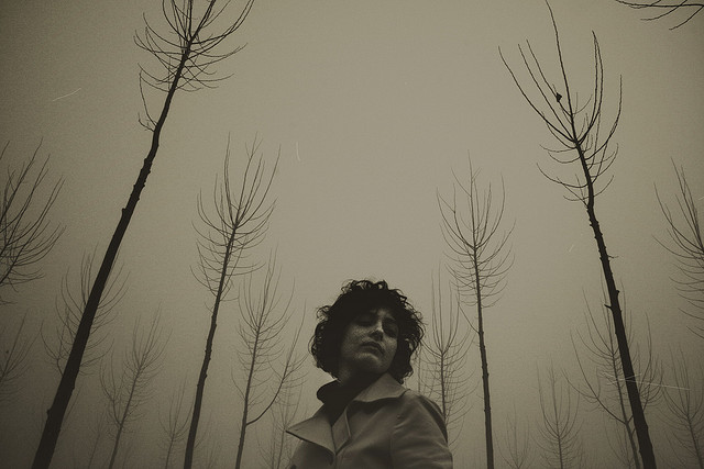


The haunting and breathtaking work of Federica Erra. Her unique perspectives with people and use of color tell stories through the quietness of her photos.
Check out more of her work here.
The haunting and breathtaking work of Federica Erra. Her unique perspectives with people and use of color tell stories through the quietness of her photos.
Check out more of her work here.
Filed under photography

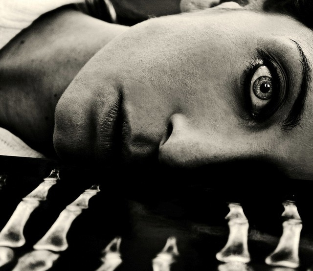
A stunning portrait of one of my favorite artists Thom Yorke by Steve Keros.
Check out more of his work here.
Filed under photography


I found out about Pablo Delfos this morning through a great post Jonathan did on ISO50. It’s really inspiring to see a photographer still using film and traditional photo processing. Delfos’ work is all in black and white and has a Surrealist touch to it. You definitely need to check out more of his work.
Via ISO50
Filed under film, photography


Loving these incredibly moody photos by greg pths. I found his work during one of my inspiration hunts on Designspiration the other day and I was really drawn to quiet sound and somber mood of his work. Give his flickr photostream a look and you’ll see what I mean.
Filed under photography


Modus Vivendi is derived from Latin for the way of living and Sonitus means sound. With the three words together, my translation goes, “The way of living through sound.” I recently displayed my work for a show called Constellation which was put on by some great friends of mine, Jim Sheppard and Liz Simpson. For this show, I decided to showcase my live band photography for the first time. I carefully selected the works that had an overarching mood and similar elements which created complimenting compositions for me to work with. Each selected work was crafted and finalized in post-production using image layering and element elimination in order to create meloncholic-minimalist pieces. One of my main goals for this project was to capture the essence of each artist in the most endearing and obscure way.
View the rest of the series here.
Filed under art, creative, Minimalist, photography, print
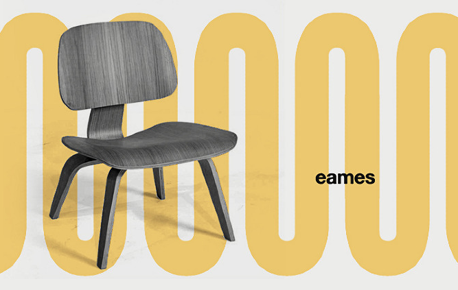

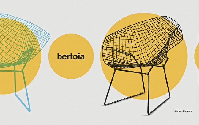
I am a huge fan of Jesse Brew‘s work and I recently decided to take a look if he had any new work. To my surprise he had tons of new projects. This is one of the new series’ I ran across called Chairs. Very Mid-Century in its simplicity and all. If you haven’t seen his work before I highly recommend checking it out.
Filed under Design, Mid-Century, poster
![]()

![]()
So here is Projection 2 from the JetstreamProjector inspiration bank on Designspiration. I chose to showcase the the three logos above because of their similar qualities and attributes. They all have the old college scholar feel with a subtle touch of masculinity. The first and last have a seal-like presence and the middle has a family crest style. The typography is strong and harmonizes well with the other elements of design that exist within each logo. If you take a look the line weights of the type and lines in each logo are very consistent with each other. All three are very memorable indeed. Check out Projection 1 if you have not done so already.
See what inspires me: JetstreamProjector on Designspiration
Also, check out Bruce Mai’s inspiration: Threefoureight on Designspiration
Filed under logo


Incredible wallpaper designs by Mark Weaver. You may remember him from previous posts here on JetstreamProjector.


I recently found out about Jimmy Turrell’s work through Jon’s on ISO50. His collage style is beautifully orchestrated by use of photography and illustration. Jimmy’s style is very unique and if you stop by his website you will most likely find yourself looking at everything he has created.
Check out his portfolio here.
Filed under art, Design, Designer, illustrations


The surrealism present in these fascinating works by Matt Wisniewski is unprecedented. I recently found out about him through Shelby White’s awesome post on the Wanken blog. Matt is a Brooklyn based web developer with a incredible talent for manipulating photos into collage gems. I would absolutely love to get my hands on prints of the top two pieces. Matt’s style is reminiscent of the another inspiration of mine Mark Weaver, who I have posted on before, but very unique in its own respect. I would love to collaborate with him in the future! What do you say Matt?
Check out more of his work here.
Filed under art, creative, photography
